Blocks are primarily added to pages and contained in sections that are templated using one of the layouts above. Some blocks are not designed for internal pages. Choose the Section Template above that conforms to the page layout you are working on before attempting to add blocks.
Accordion Layer
General Use: Add accordions to a section – this block does not allow nested accordions.
Horizontal / Vertical: Horizontal – use on Card Deck layout or Content with sidebar.
Example:

Basic Block
General Use: Place in any section template you need to add body text or other content.
With: Card Deck Layout or Content with Sidebar.
Example:
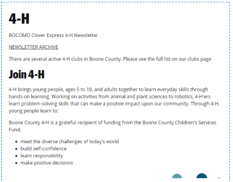
Big Message Layer
General Use: A marketing block for full page horizontal layouts. Includes Mizzou styling, Title, Text and button.
Use With: One Column Layout
Example:
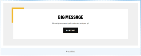
Button Layer
General Use: Easy way to add Mizzou branded buttons.
Use With: Card Deck Layout or Content with Sidebar.
Example:

By The Numbers Layer
General Use: Easy way to create cards with statistical information.
Use With: One Column Layout.
Example:
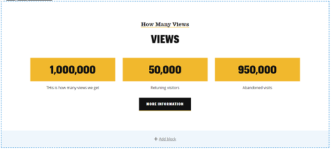
Call to Action Layer
General Use: A marketing card with a call to action button
Use With: One Column Layout
Example:
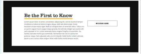
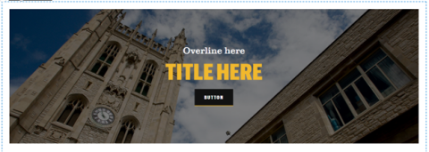
Hero Layer
General Use: To add a full width image to a page as a hero – include text and buttons.
Use with: One Column Layout
Example:
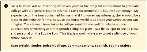
Information Block Layer
General Use: Add a block of content with an information icon. Options exist for background color (light gold, light black, light blue and light green) and border/no border.
Use with: Card Deck Layout or Content with Sidebar.
Example:
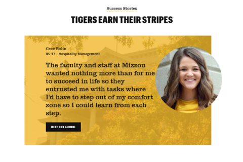
Quote Layer
General Use: Add a quote with a circular picture to a full width landing page.
Use With: One Column Layout
Example:
Resource Sharer Layer
General Use: Add a special layer to your layout that has a left-hand square image (or no image), link and body copy that spans the width of the layer you place it in.
Use With: Card Deck Layout or Content with Sidebar.
Example (no border):
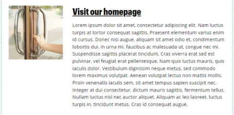
With border:
Split Layout Layer
General Use: Add a split card with picture/image on one side and text on the other. Can have buttons and custom images.
Use With: One Column Layout
Example:

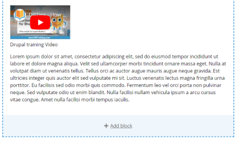
Video Block Layer
General Use: Add a video to a layer. (Still being styled)
Use With: Card Deck Layout, Content with Sidebar
Example:
AddToAny follow buttons
General Use: Use to place social media buttons on a Program or County page where appropriate. (Still being styled).
Use With: Card Deck Layout or Content with Sidebar.
Example: